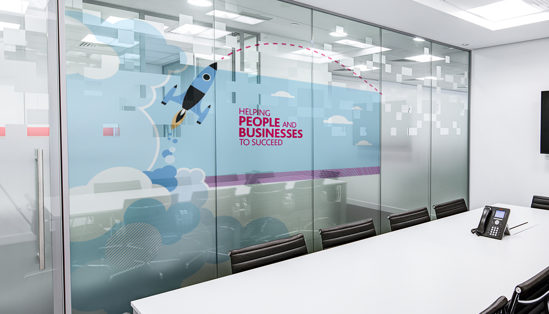
Cima
Brand experience · Illustration
01 — Credits
Client
Cima
Sector
Education
Work
Corporate identity restyling
Country
United Kingdom
02 — Motif
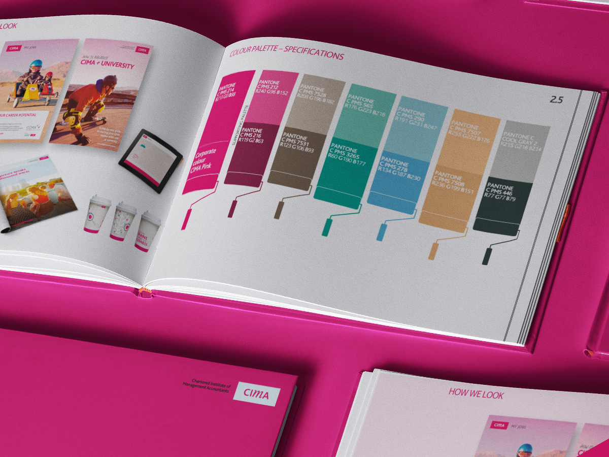
03 — Colour
#E30061
#92CFDA
#E84582
#F9C087
#BAAB9A
#C1C3BD
#6EC4B4
#FFFFFF
Brand palette
01
Brands age too. Cima had an image that did its job but no longer said who it was. The work was about renewing it from the inside: not just the logo, but every code the brand speaks with.
02
A different vision
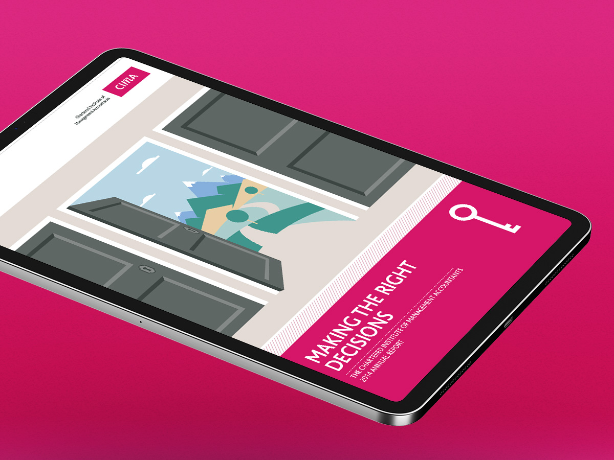
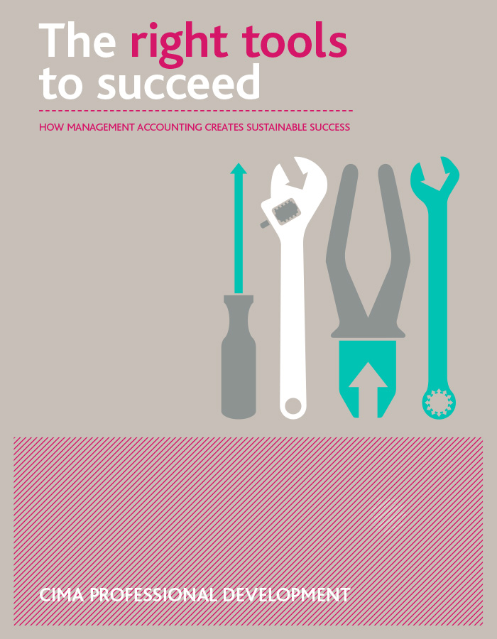
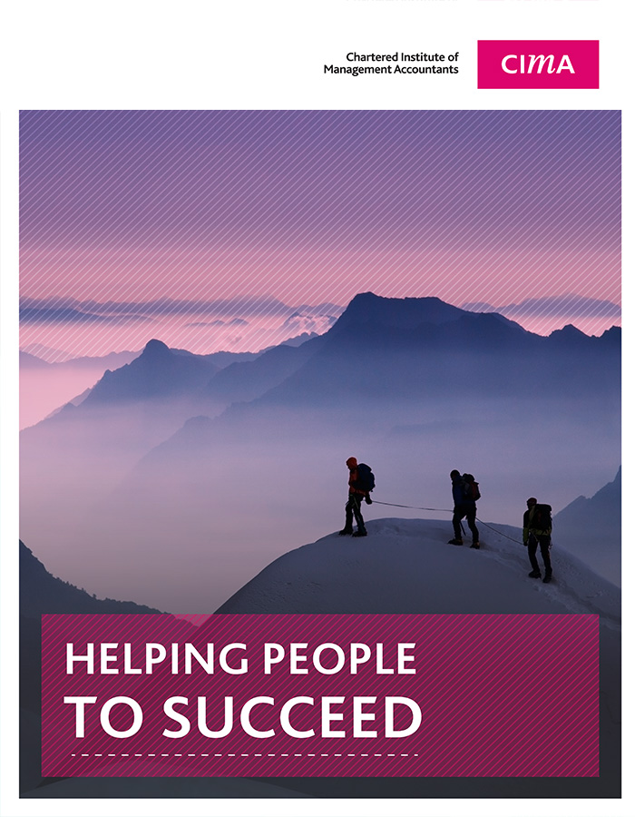
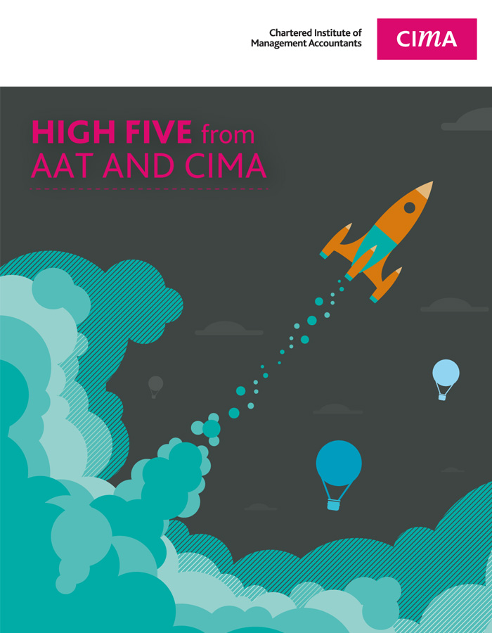
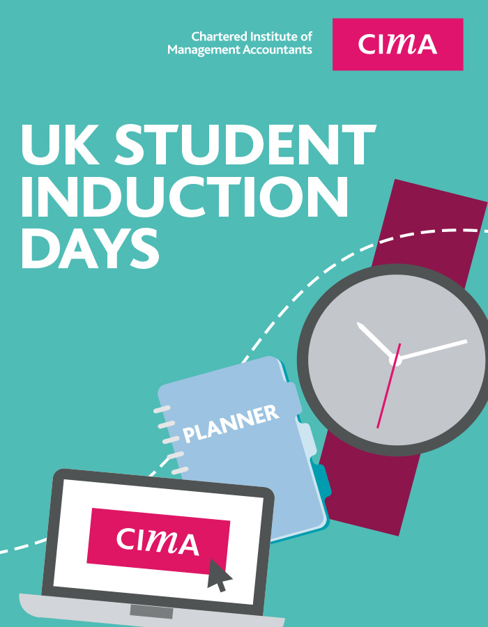
We updated the corporate image by redesigning all of its communication codes: a new graphic language, illustrations, tone and assets that keep the brand from ageing.
03
A unique graphic style
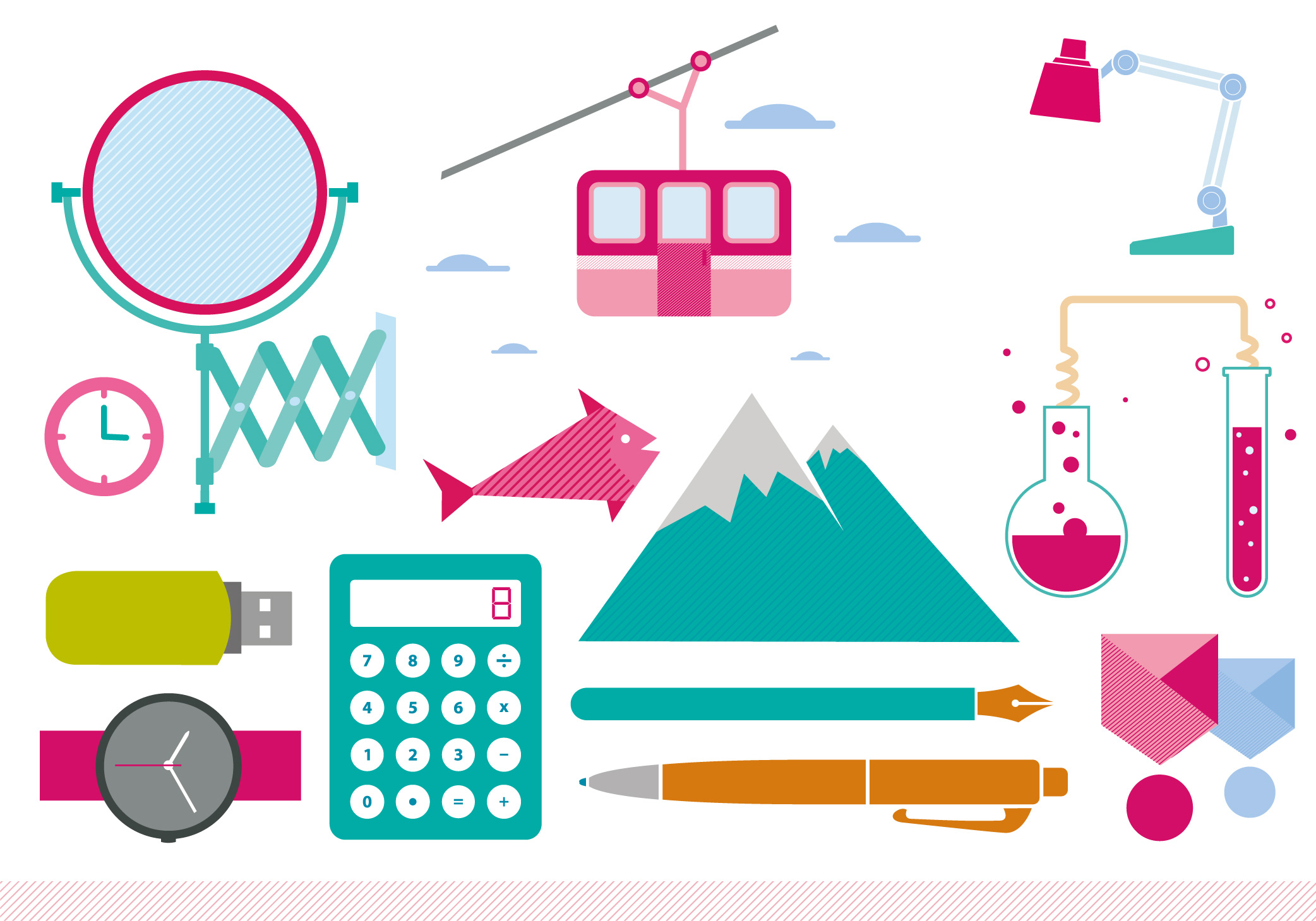
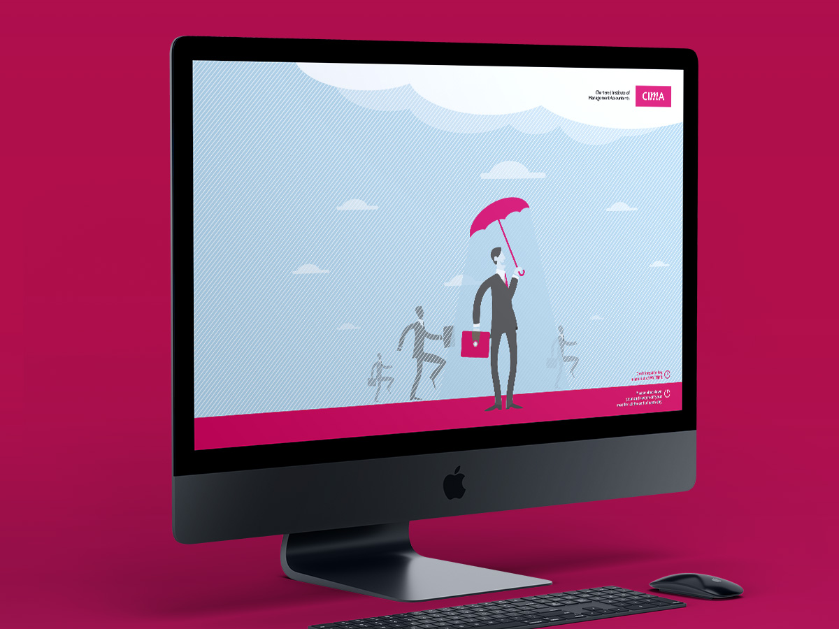
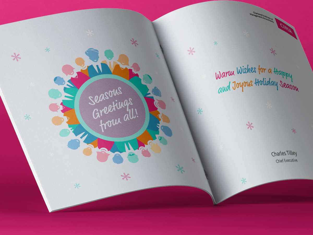
An illustration style of its own to bring the brand's values up to date: fresh, and made for its audience.

04 — The brief
A full restyling of Cima's corporate identity, in education in the United Kingdom: a new visual language, a voice of its own and assets that keep it current.
05 — The little details
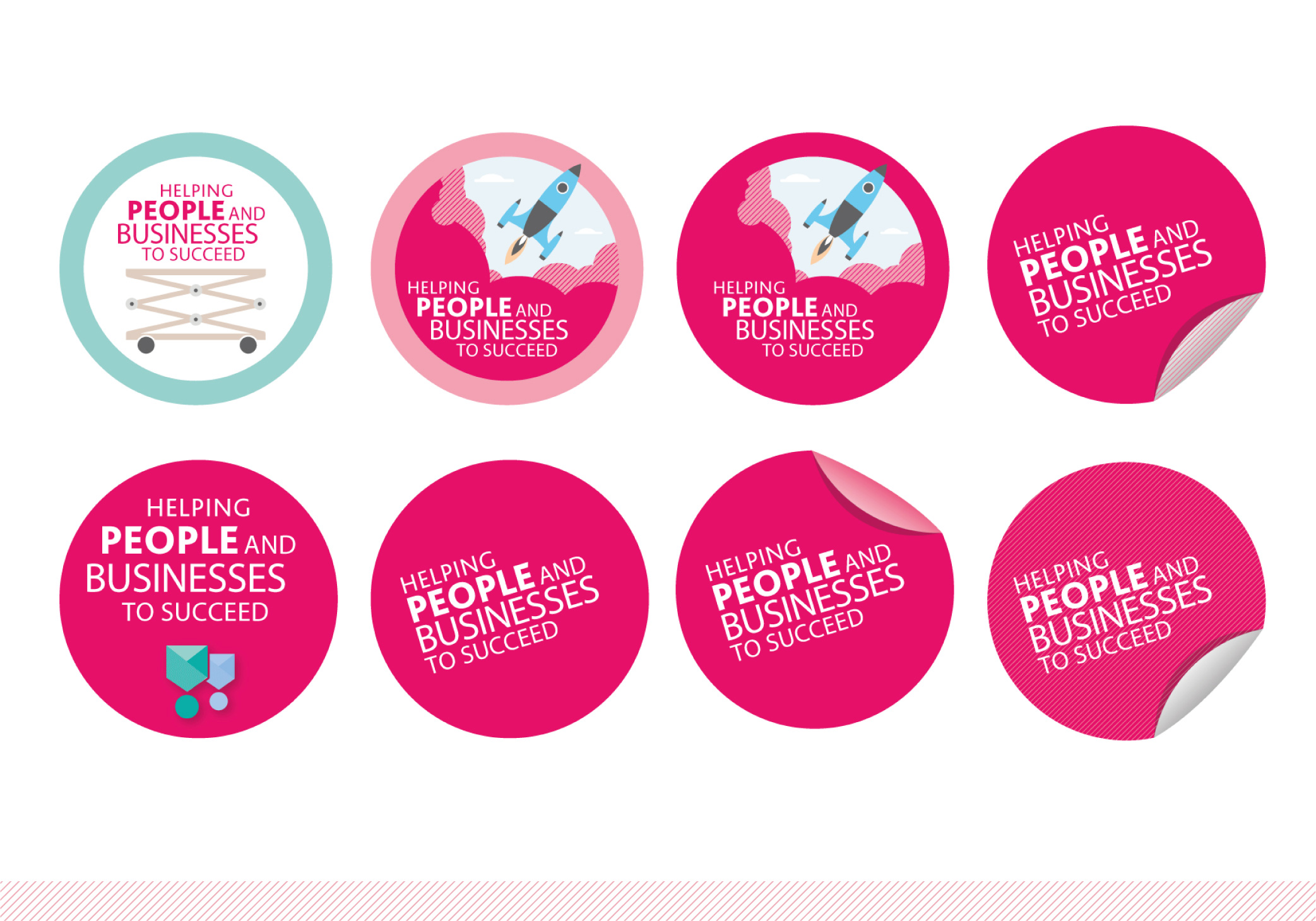
make us great.

06
A unique brand
Original images that reach every potential client further. We speak and think differently, and the audience still understands us perfectly.
07 — Our answer
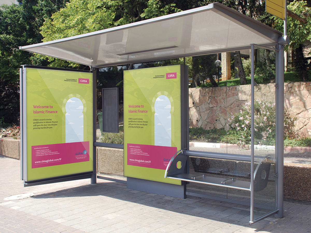
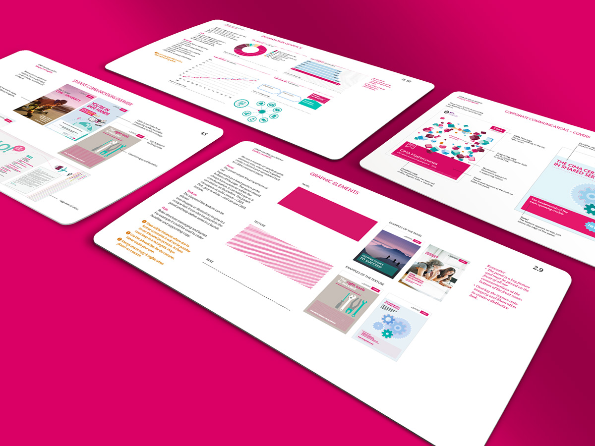
A fresh, recognisable illustration style, a broad and cheerful colour palette, and a system of posters and pieces that takes the brand into classrooms, spaces and everyday communication.