Colegio de Logopedas
Brand experience
01 — Credits
Client
Colegio de Logopedas Madrid
Sector
Services
Work
Corporate identity design
Country
Spain
Website
www.colegiologopedasmadrid.com
02 — Motif
03 — Colour
#008054
#009ECE
#000000
#FFFFFF
Brand palette
01
A speech therapist works with the most delicate thing we have: the way we say what we think. For the Colegio de Logopedas de Madrid we looked for an identity that spoke about that, free of medical clichés, with language as the protagonist.
02 — Colegio de Logopedas
de Madrid
Speech therapists help people make the most of their ability to communicate. The challenge: a visual identity unlike any other in the sector, one that faithfully reflects the profession's work.

03 — Corporate identity
Another way of understanding communication
Speech therapy prevents, assesses and treats communication disorders: voice, speech, oral, written and gestural language, hearing and orofacial functions, in children and adults.
04 — The idea
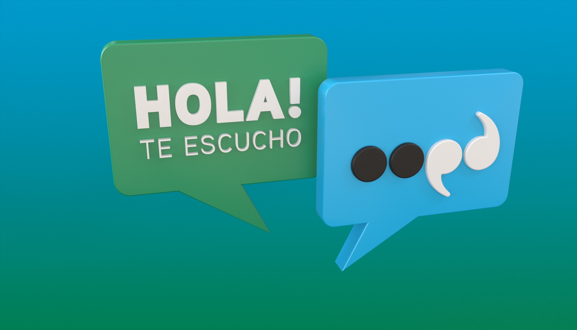
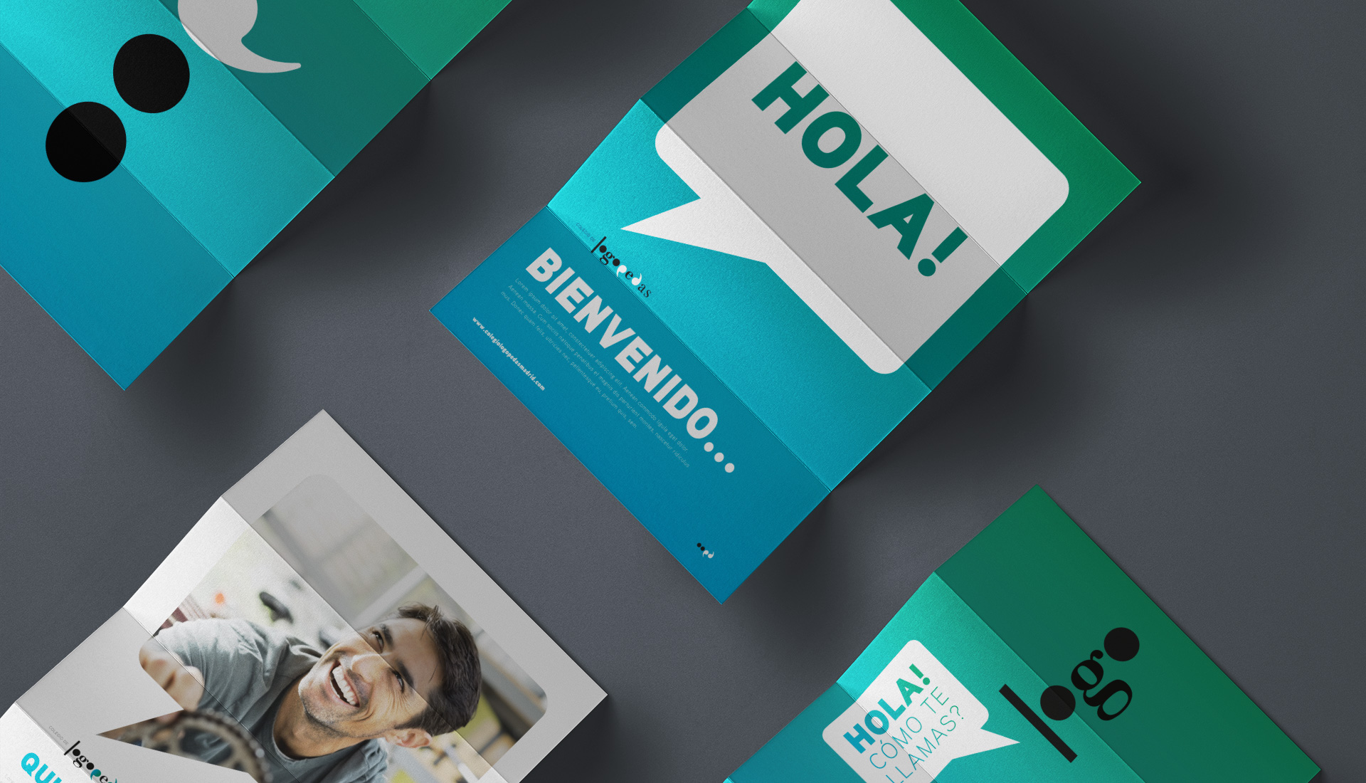
Punctuation marks are the visible side of the rules that let us understand each other. The full stop and the comma become the brand: tiny pieces that order, separate and give meaning, just as the speech therapist does with a patient's communication.
05
A speech therapist takes communication that seems to make no sense and turns it into something everyone understands.
www.colegiologopedasmadrid.com
06 — A different image
An identity that represents the real work of a speech therapist.
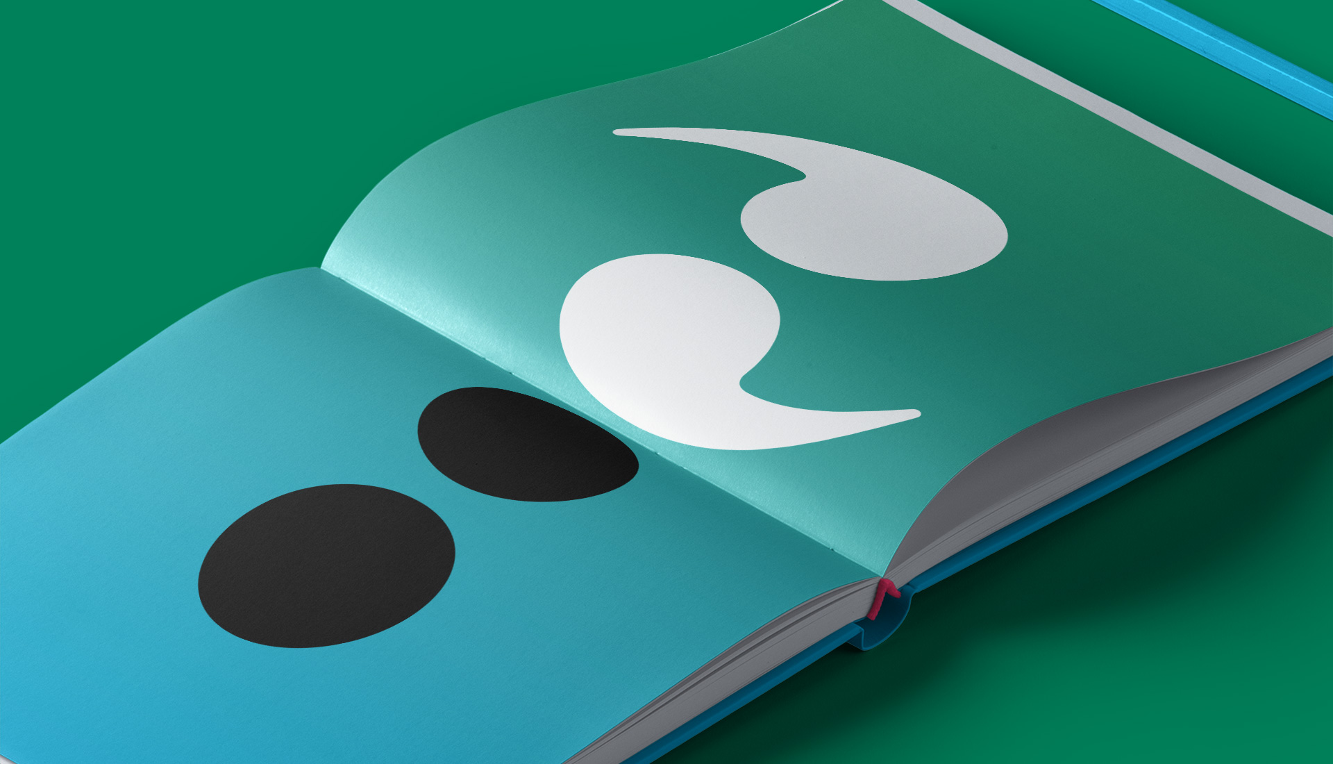
We understand each other thanks to rules we all know, and those rules have a shape: punctuation marks. The full stop marks out, divides and closes; the comma gives meaning, joins and makes what we say clear. And together, as quotation marks, they mark what is literal: what a person is really saying. That is where the identity comes from.
07 — The identity at work
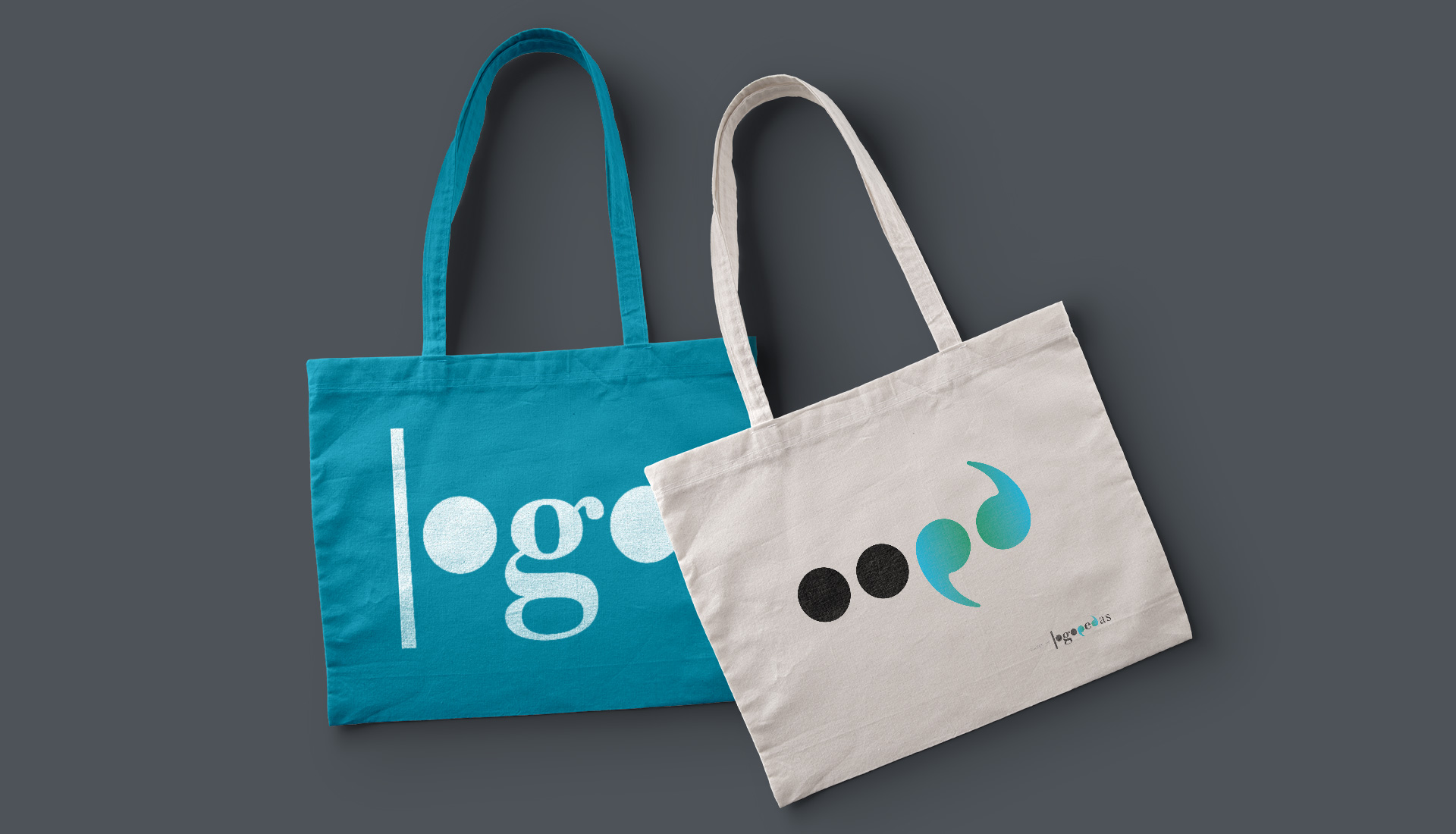
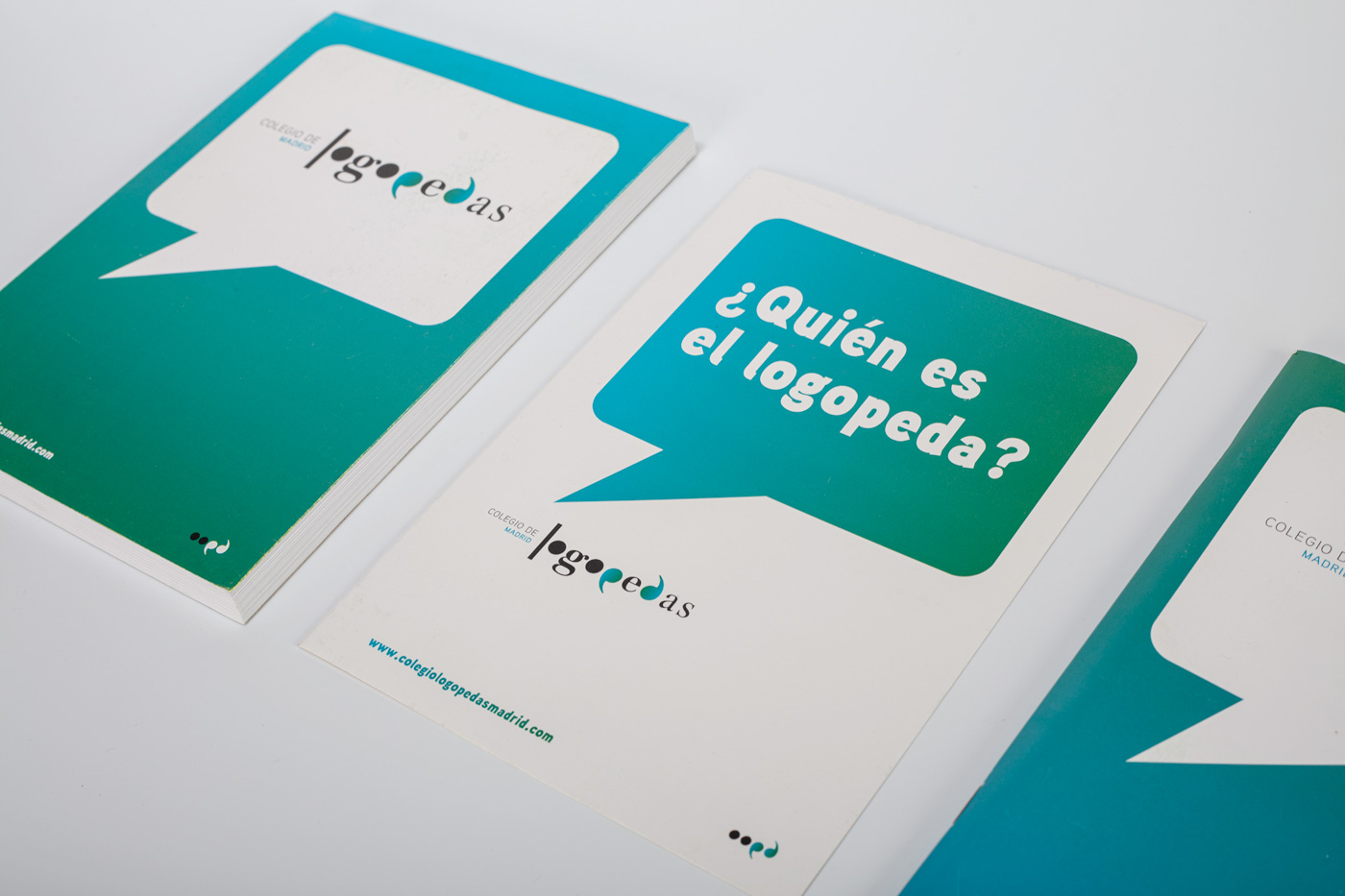
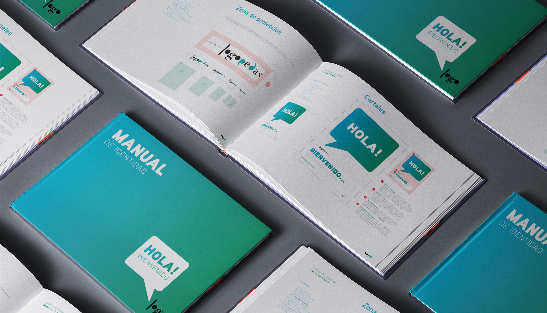
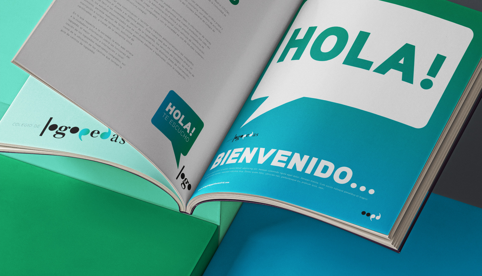
The system unfolds across the animated logo, a series of posters, bags and stationery. A short palette and simple geometry make every application instantly recognisable.