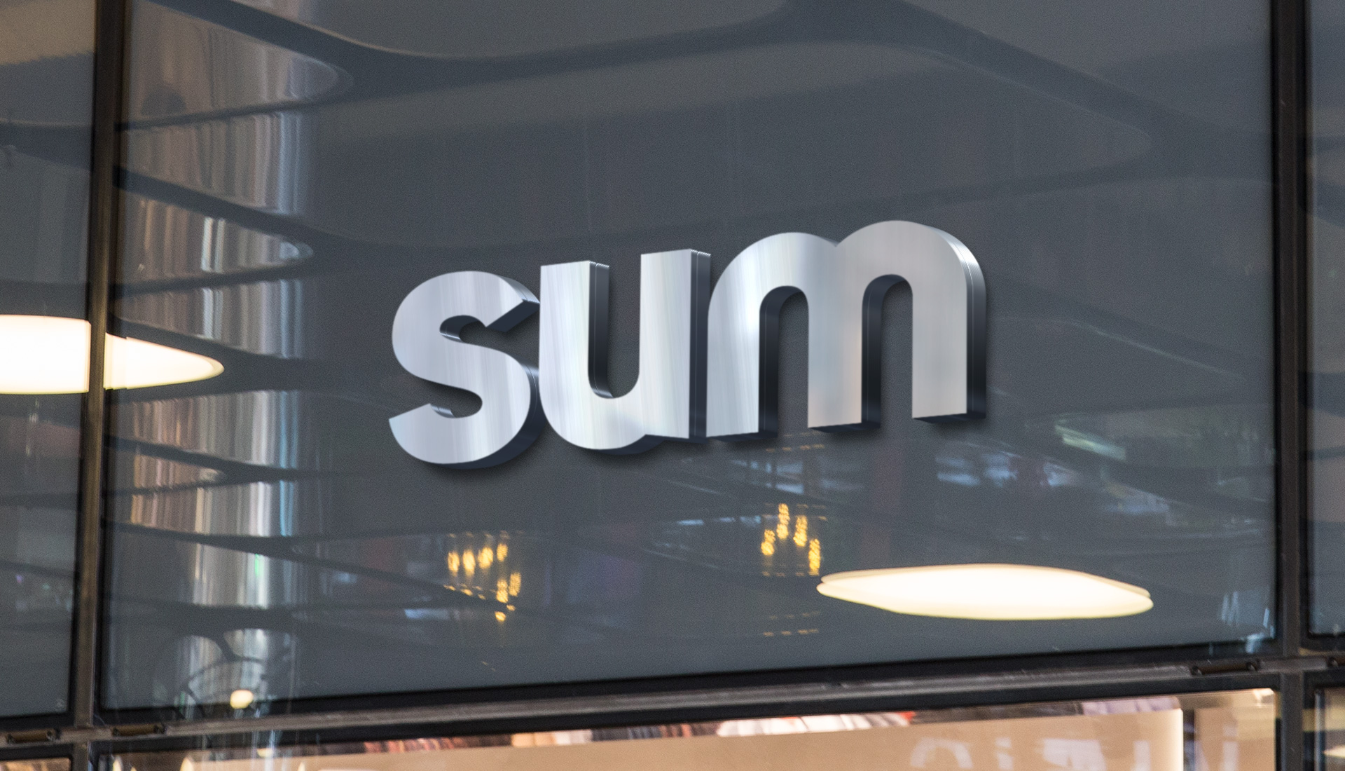
Sum
Brand experience
01 — Credits
Client
Sum
Sector
Services
Work
Corporate identity
Country
Spain
02 — Motif
03 — Colour
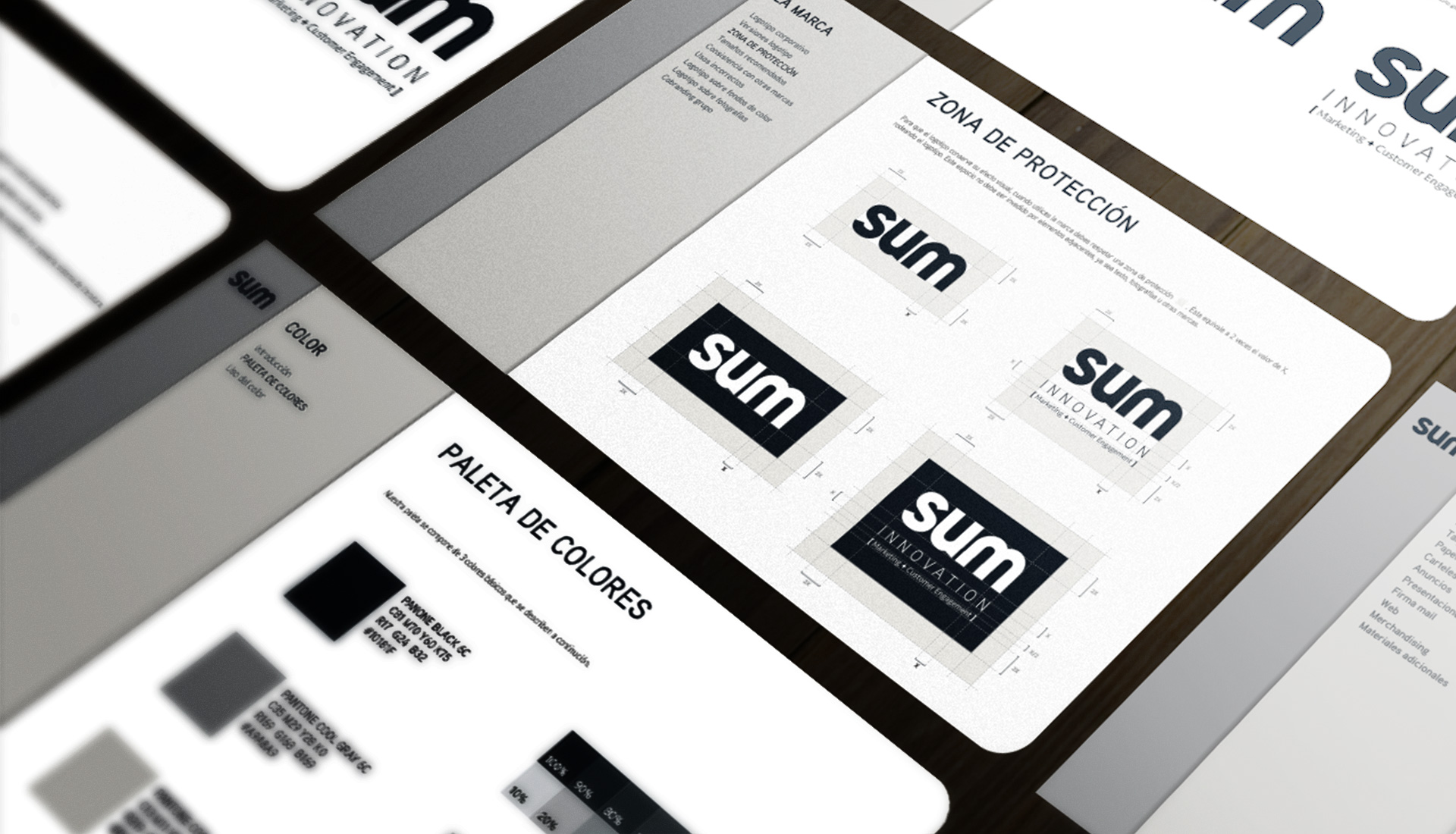
#10181F
#FFFFFF
#A9A8A9
#DAD8D6
Brand palette
01
Selling is not what it used to be. SUM was born to help companies grow in a world where the customer decides when, how and where to buy, and its brand had to convey that sense of method, closeness and movement.
02 — SUM
B2B Sales Intelligence
A brand that helps companies grow by designing new ways of selling and relating to customers.
03 — SUM
A customer-centric growth platform for the digital age
Solid foundations for organic, sustainable growth: new ways of selling that look after the customer relationship at every stage of the journey.

04
SUM, sales experiences that create connection and commitment
05 — SUM
A customer-centric company.
SUM breaks down the barriers to innovation and keeps improving sales processes: truly understanding what customers need and building a value proposition that earns loyalty.

06 — The brief
A corporate identity for a B2B sales intelligence platform: serious enough to inspire trust, alive enough to speak of innovation.
07 — Our answer
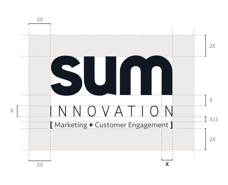
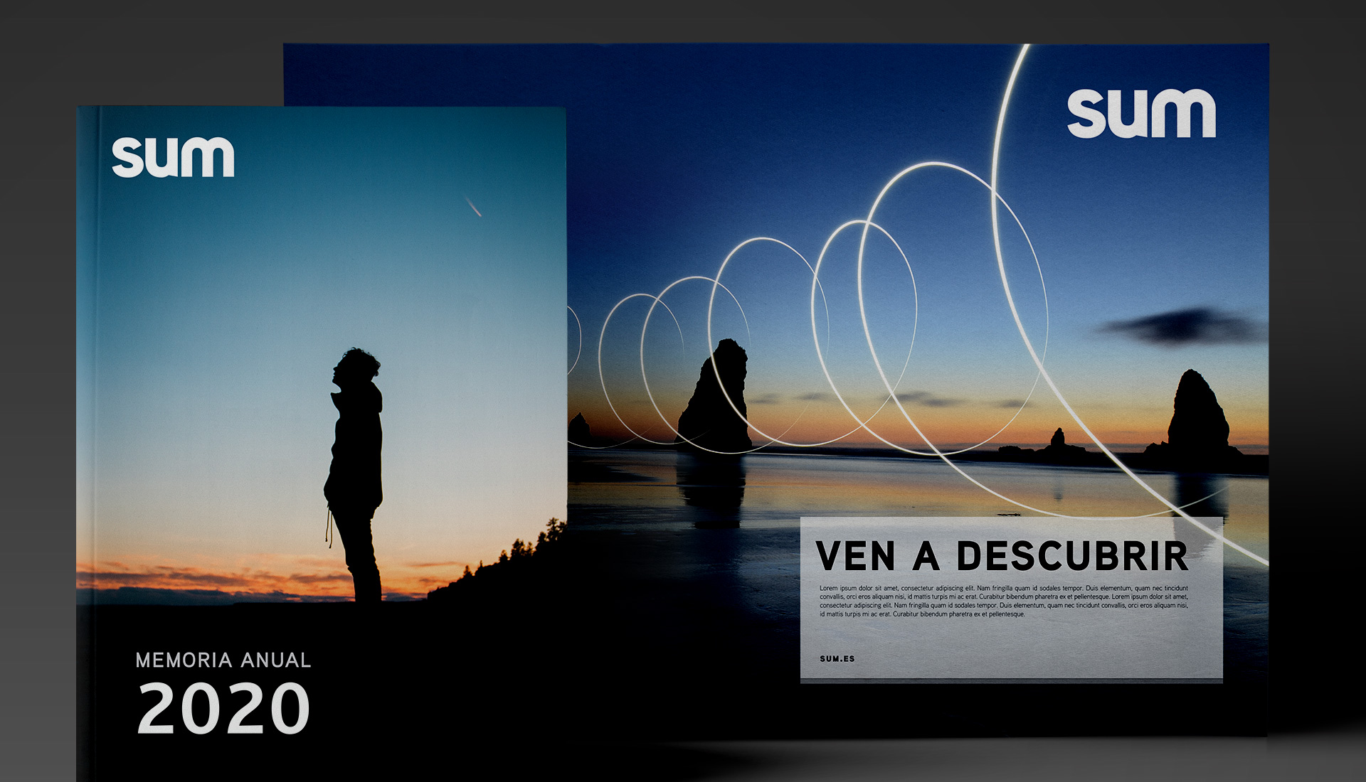
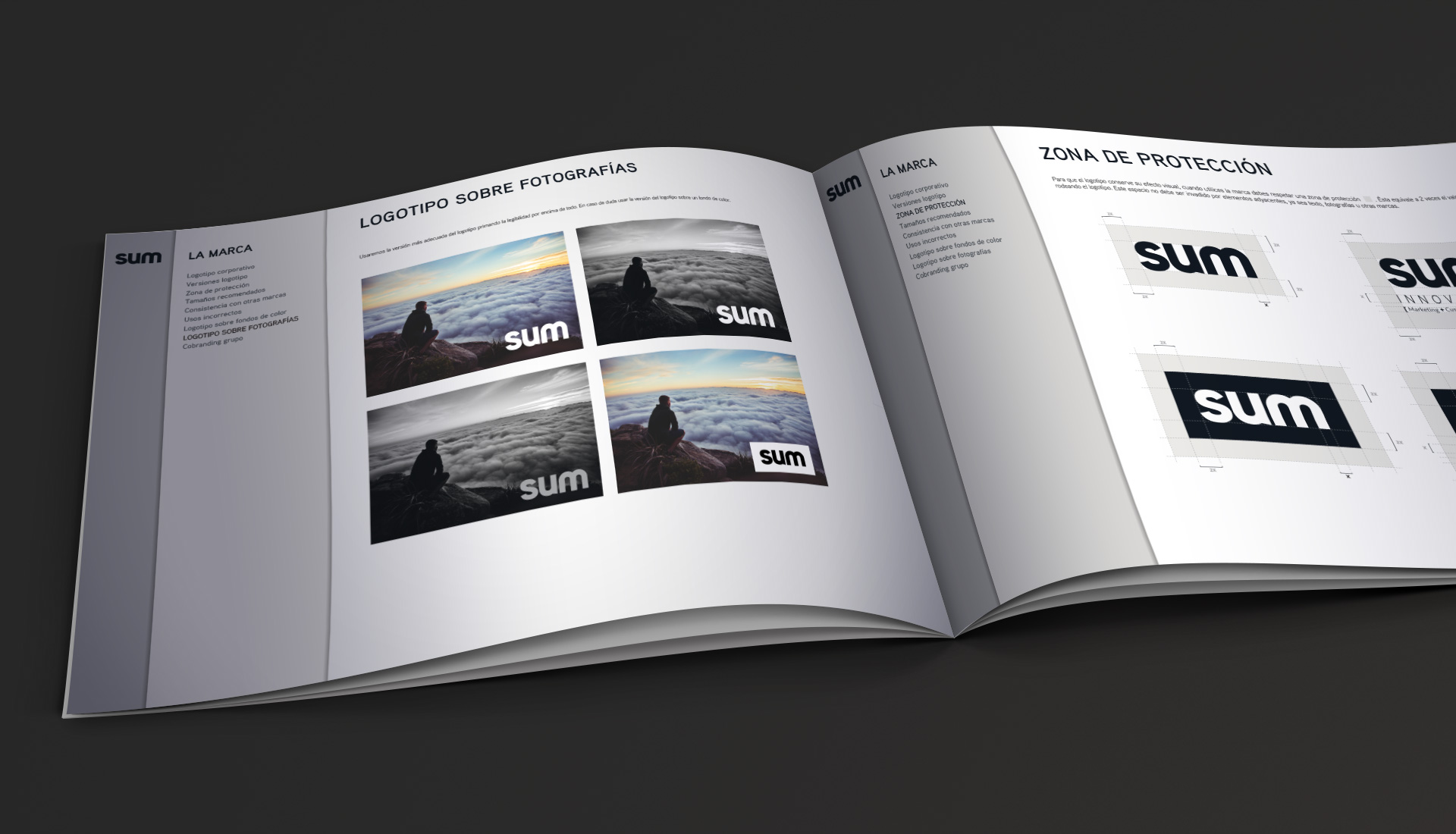
A bold logo, a restrained palette of greys and midnight blue, and a system that works just as well in stationery, spaces and video. A brand centred on people, like the business it represents.